Web Design & UX
Responsive Web Design You Need For Your Website

Web design- sounds fun and it is! You’re able to be creative with its aesthetic as the boss of it. You can go the colourful route and keep it clean with minimalism. However, it’s undeniable to say that what makes a good website depends on how responsive it is. Therefore, in this article, we will be tackling this topic and breaking it down on why you need it for your website.
Contents
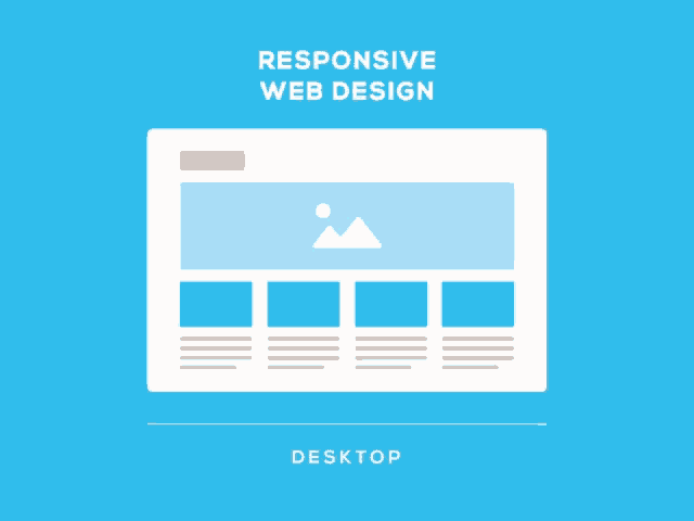
What Is Responsive Web Design?
The proliferation of displays and gadgets on which we are increasingly reliant in the twenty-first century has prompted responsive design. Therefore, the responsive design tries to solve the challenge of different screen sizes by creating a single system that works on any platform- be it a large desktop or a little smartphone.
As a result, you’ll get a consistent user experience no matter what device you’re using to view it on. Whether you’re on your phone or tablet, you should be able to get the material you want, tailored to your specific requirements at the time.
These restrictions must be dealt with by UX designers in order for them to design correctly – failing to do so can seriously harm the user experience of your website or mobile app. In a nutshell, responsive design implies that your website should look nice, be simple to navigate and operate on any device with any resolution.
Types Of Responsive Web Design
Fluid grid
When utilising CSS to build flexible grids, the columns adjust to match the size of the screen or browser window, whether the user is using a 21-inch desktop computer, a 13” laptop, a 9.7” tablet, or a 5.5” smartphone. This allows designers to keep the same appearance and experience across various devices. It also saves time and money for everyone by allowing designers to change one version of the website rather than several.
Media queries
We may use a media query to target not just specific device classes, but also the physical attributes of the device that is performing our work. Developers may use condition checks in media queries to change site designs based on the characteristics of the user’s device. This is preferable to just specify breakpoints in HTML/CSS since it gives the user a more personalised experience.
Flexible visuals
Using code to prevent rich media files from outgrowing their containers and viewports. The graphic within the flexible container resizes as the container resizes. This feature allows designers to build timeless designs that can adapt to any device, regardless of size or form.
Things To Keep In Mind

At least three breakpoints should be used
Breakpoints are points in a website’s CSS that change how information looks at various screen resolutions. In responsive design, min-width and max-width values relate to the minimum and maximum width of pixels across a screen or for elements, respectively.
Therefore, to function correctly, most responsive websites will require at least three or four breakpoints. Breakpoints are often split out for mobile devices, tablets, and desktop views; however, you can have more to cover all bases and increase device flexibility.
Start with minimum-width breakpoints
Each breakpoint in your responsive web design will have a min-width and a max-width, as we discussed earlier. A solid rule of thumb when designing with the mobile-first strategy, which is suggested, is to start creating from each min-width of your three breakpoints.
With that, in this manner, you may build displays for smaller devices first, then add additional information and UI components as the screens get larger. However, remember that scaling upwards is usually simpler than scaling downwards.
Prioritise content
Content is at the heart of responsive design. Assuming you’re following the suggested mobile-first strategy, this implies you should prioritise key information for mobile and add more as the screen size grows. Shorter, simpler interactions are preferred by mobile users.
As a result, this implies they’ll be on the lookout for more targeted content. Hiding material and exposing it only when needed can assist to provide a consistent user experience. However, there are instances when you just need a specific amount of material on a website, so employing collapsible and expandable menus might help you out.
Fluid and responsive layouts
When it comes to mobile-first design, the terms responsive design and fluid design are frequently used interchangeably, although they are not interchangeable. The breakpoints at which the content of the UI adjusts to scale upwards or downwards are defined by responsive design using fixed units of pixels. Fluid design, on the other hand, employs percentages to scale content dependent on the size of the screen you’re using.
When it comes to responsive web design, button design is crucial. On a desktop, a button may be simple to click, especially with the aid of a mouse. What about an iPad, though? Or how about a smartphone?
The finger lacks the fine accuracy of a mouse. With that, this category also includes links and other clickable places. If the click area is too tiny, your users may become frustrated. Allow consumers to be accommodated by making sure your buttons and clickable spaces are adequately suited for this average for improved usability.
Examples Of Responsive Web Designs
1. Magic Leap
Magic Leap’s beautiful graphics are brought to life by a simple, mobile-first website with parallax scrolling. The user experience on all Magic Leap platforms is identical, with one exception: the microscopy that urges users to scroll, which is present on desktop computers and tablets but not on mobile devices, where scrolling is natural.
2. Wired
Wired optimises content across all platforms to ensure that consumers can easily get the information and stories they desire. When comparing the mobile version to the desktop and tablet versions, this is an excellent illustration.
As a result, the former is dramatically streamlined to avoid overwhelming the user, and it makes use of the limited area to show the “Top Stories” first. Wired’s stories are easy to share because of the seamless navigation and easy-to-find social icons.
3. Smashing Magazine
Smashing Magazine goes above and beyond by providing a personalised experience across all platforms. On desktop, their website has a two-column layout, a full menu, and a combination mark; on tablets and mobile devices, it has a one-column layout, a reduced menu, and a letter mark. It’s also an excellent example of accessible design. Desktop users will see a menu with both labels and icons.